Hardware Design Critique

There’s a lot of feedback towards software, and people are touching points on issues I’m already facing so no point of just repeating the same things over and over.

However I’m gonna give some feedback on the hardware.

Back Cover
First I want to say that I love the feeling of the phone in the hand. I always preferred plastic/poly-carbonate/leather/wood/metal finishes compared to the glass slabs we have had for a long time now.

If Mudita sells us replacement back cover it would be awesome. Please consider this.

Case
The case feels nice by itself, but adds a bit of bulk to the device which I don’t like. Hopefully get get some slimmer cases in the future for us that are careful with our devices and we just want to protect them from scratches.

Weight:
The device with screen protector and case weighs at 198 grams.
Without the case and only the screen protector is 175 grams.

Which is more than iPhone mini at 135 grams, but it’s understandable because it has a bigger battery and a different screen technology which contribute to this.
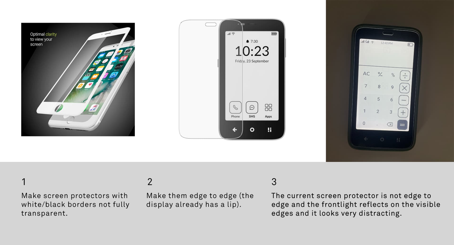
Screenprotector
Has the issue of not being edge to edge which causes the screen protector to glow if you’re using the phone at night with backlight turned on. To me is super-distracting.
The phone has a lip on the edges, so why not make the screen protector to fit perfectly. And when you put on the case the light glow wouldn’t be visible.

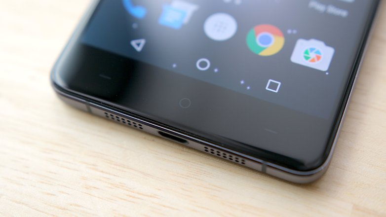
Back/Home/Quick setting buttons
I’ve tried to make my peace with them when I ordered the device, but I gotta say this is the crappiest part of this phone’s design. Who thought about adding giant white icons was a good idea for a minimalist product? A giant arrow to the left, and the quick setting icon that is trying to tell a story.

A lot of phones have customizable buttons, so you can put the back button on the right. A lot of us are used to this, especially if u had a Samsung phone in your early days.
For example I remember OnePlus X a budget phone from long time ago had this subtle markings, just two thin lines for the side buttons. And you could set the back button to which side you wanted.

Obviously it’s too late to make hardware revisions, but I would ask Mudita to consider a fix to these two issues by offering Screen protectors with borders like how iphone6-9 era.

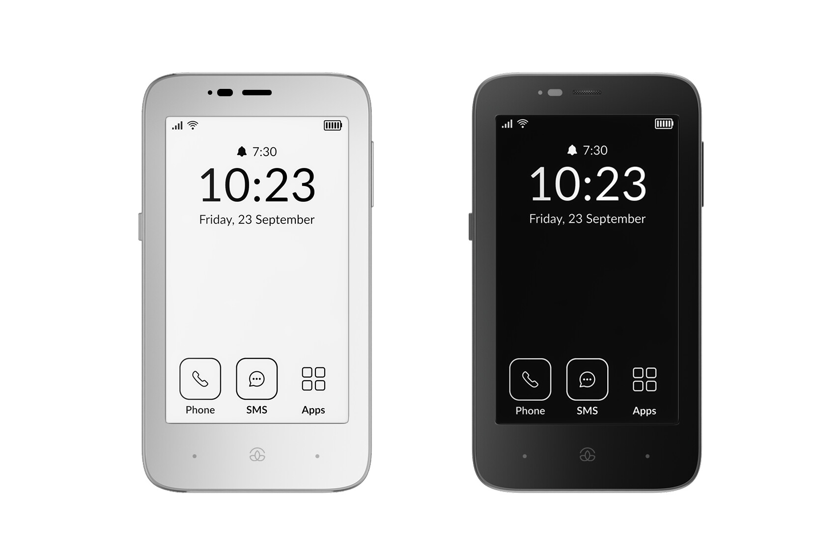
You could even replace the home button to a small Mudita logo, plus you could give us a white front screen since we’re using Light mode only. It blends better.

Screen protectors break, so I’m pretty sure you’re gonna be ordering more to sell on your store. So please consider this option.

I’ve read comments on Reddit and YouTube how they wouldn’t buy this phone because it looks like it’s designed for Old People. And I think that’s related to the Giant Icons.

5 Likes

Interesting points.
Some of these things are a matter of taste, though. For me I have to say that I REALLY like the visually clear back/home/settings buttons. Very user friendly, and they do exactly what they are supposed to.
For context though, I have always hated with a vengeance the move towards flat design, which I think makes it much more difficult to use appliances and software. I like clarity and user friendliness. But if one likes flat design, I can see why they might feel intrusive (am not going to judge, some people even like ananas on their pizza).
Otherwise I agree.

2 Likes

Thanks for the reply.

I think that the nature of this device’s screen technology calls for flat design as it has low resolution and no color, even shades of gray don’t show well on it.

I do agree that some of my points are a matter of taste, but I just explained how having these icons as fixed limits functionality that could have been added to the device’s software.

My first ever smartphone was a Samsung and they always had the back button closer to the thumb (right side). After 15 or so years it’s still installed on my brain that it doesn’t matter how the icon looks, the right side is always the back button. And I’m not alone on this matter, I saw another user here mentioning the same.

While making the icons minimal could have allowed them to add flipping setting without causing confusion. I think I’ll be able to remap them using keymapper but that’s an app staying on the background and wasting battery/memory.

Anyway the solution (with bordered Screen Protectors) I’m suggesting is optional, which could help users like me and those that like the look of the icons could keep a transparent screen protector.

3 Likes

Yeah I have a feeling once mine gets here and I have it in the hand I won’t put the case on it, I don’t drop my phone I am very careful with it , and the Kompakt is built like a beast anyways, I think I will just have a screen protector on it like I do with my light phone 2, I have had that phone almost a year with no case on it and there is not a scratch on it

1 Like

The phone gives the impression that a protective case is unnecessary anyway. The casing seems very robust and not prone to scratches. Besides, the Kompakt is already bulky enough. An additional case would negatively reinforce the impression, in my opinion. So, I only use it with a screen protector, just like you are planning @minimalist4life .

3 Likes

Nice yeah I ended up getting the case but will most likely only use it when hiking

1 Like

@thilodus @minimalist4life

My usual recommendation is to stick with the case for a few weeks until you get the feel/size/weight installed in your brain, just so it doesn’t slip up or fall accidentally. After that usually I’m good without a case.

But hopefully Mudita will sell us replacement back-covers, I wouldn’t mind buying one to replace it after a while

2 Likes

I’m fine with the design but I like your ideas, not gonna lie I’d also like smaller front bezel in the color of the case. The icons and bulkiness might add to the feeling like it was an old-man’s phone but it’s not as evident as with some of the bar phones with huge buttons.

2 Likes

The shape of the phone is very nice, even the bezels I’m fine with. Eink has front lighting so the light needs to go somewhere. But if we could get Screen protectors with white borders because of the white screen the bezels would be less visible.

@urszula Please consider this (see mockup I made in the post).

2 Likes

@gezimos I’ve forwarded this thread to the team :slight_smile:
One thing I will add is that, a lot of this is subjective. I’m not sure if you have read some of the other post about users not wanting the Mudita Logo on their lock screen because they did not want to look at branding & here you are, putting it on the HOME button :slight_smile:

I’m not sure what everyone else thinks, but design/hardware critique often walks a fine line between objective assessment and personal taste. What’s “minimalist and elegant” to one person might feel “bland and overly simplified” to another. And when it comes to phones, people have such ingrained habits and aesthetic preferences that even small choices (like button placement or screen size) can spark strong opinions.

3 Likes

Well said @urszula.

1 Like

@petemeister Check out the post from Friday- you can’t please everyone :slight_smile:

1 Like

The home screen logo is a different story, it’s giant. Something subtle like this I wouldn’t mind. It was just a workaround when you remove the Logo from home screen like your CEO said and have some subtle branding on the front.

Just give us some screen protectors with white borders like the iPhone 6-9 era that would hide the big back arrow/quick setting icon to something more subtle.

The very least add the functionality to flip the buttons, I’ll try o make a vinyl skin to cover the icons myself.

1 Like

The argument about something looking like it’s designed for old people is crazy to me. Yes, it’s simple, large, and clearly visible. It reduces distractions and it’s great for your eyesight. Maybe old people are onto something??

6 Likes

@The I think I’m OLD…Maybe that’s why I love my Mudita Kompakt :black_heart:

5 Likes

The argument is based on how most of today’s. dumbphones are some keypad/flip phones with giant buttons/icons, they’re targeted to old people. I’m not the one who’s saying that, it’s the brands that sell them they call them Senior Phones.

We can disagree on what looks good, and what doesn’t. But my opinion is that the icons are too big, too bright.

The rest of the phone feels great to me.

1 Like

I just wanted to add my two cents to this response.

You’re completely right that a lot of the design suggestions is completely subjective. Injust wanted to share my taste.

Personally, I think the small logo instead of the home button like suggested in this topic does look a lot better than as something big on the lock screen. I think it would be a subtle nod to Mudita without it becoming too overpowering. This idea reminds me of the simple way Mudita added their logo to the Mudita Moment on the back. So, if you wanted other opinion’s here’s mine.

As for the suggestions, I really appreciated reading the thoughtfulness here when it came down to details, such as the screen protector and having white edges. Wonderful feedback, I hope Mudita takes into account. Really loved reading and seeing mockups! @gezimos You should work for the design team!

2 Likes