Yes but visually I do not have a way to see traffic on the map (or disable traffic-aware). I do plan on supporting multi-route selection in the future so you can see which is the fastest option.
PaperCal uses DAVx5 so it supports any calendar type that DAVx5 supports. I personally have not tried an Apple Calendar setup.
Added PaperMaps and PaperCal to my phone — these look great!
A few questions:
With PaperCal…I use reminders a lot. It looks like there isn’t a way to add reminders yet?
With PaperMaps, I love that there is traffic integration. I rely on this feature a lot. The map is very clean and legible. I was wondering if you plan to add a TTS engine? I’ve tried to add one to the Kompakt for other map apps and it crashes in Settings. It seems like having an onboard engine is the only option. I see a speaker button in the left corner.
Is there a way we can buy you a coffee to support your work?
@davidray: IF – and I know that it is a big IF – you are open to seeing two issues here about how PaperMaps Alpha 2 behaves on an AOSP-based, deGoogled BraX3 cellphone while I wait for delivery of my second Kompakt, THEN here they are below, as I did not see where to post feedback in GitHub:
Issue #1 with PaperMaps Alpha 2 on BraX3
The setting for using current location repeatedly found my next-door neighbor’s house address until I moved more than half of a house lot away from that neighbor and toward my other next-door neighbor’s house, at which point it found MY house address.
In contrast, I never have that problem when I enable the “Use device location” slider in CalmMaps > Settings. It always sets “Current Location” to MY house address when I am within the perimeter of my house lot.
Issue #2 with PaperMaps Alpha 2 on BraX3
The cropping of pages seems to be fixed to the dimensions of the Kompakt’s display. In case you ever want users of other AOSP-based cellphones to use PaperMaps, then you may want to consider using the cellphone display’s height and width and presence or absence of a classic navigation bar to drive the PaperMaps page’s height and width.
Notice how you can see the left side of the next page in the right side of this screenshot, and notice how you can NOT access the PaperMaps controls at the bottom of this screenshot, presumably because the positioning of those controls is based on how the Kompakt handles UI navigation and NOT on the classic navigation bar, which perpetually blocks my access to the PaperMaps controls:
Can you elaborate on “reminders”? I think you’re referring to reminders on events. I.e. It will notify you “x” minutes/hours before the event. This is actually supported as is. On the edit/add screen you will see an input for reminders. The UX needs to improve but as is, it will show three “None” reminders. Clicking one of those will allow you to set a reminder.
What are you wanting the TTS engine to do? Currently, the turn-by-turn instructions are voice guided. Are you wanting a text style instruction list?
Embarrassing…I have to admit that I did not click on “none” — I guess I was looking for a drop down or some sort of visual cue. I just linked my calendar with DAVx5 and can now see how it operates better with events that were already in my calendar with reminders.
Oh fantastic! I tried it out at home, not driving, and it was silent like other apps without TTS so I made a bad assumption. I’ll try it out in the car soon.
Hello, I am new to PaperTunes, and I have a question (btw thank you so much for all these apps!): why can’t I view stuff I downloaded from Youtube in artists and albums tabs? I downloaded via PaperTunes.
This will be coming! YouTube Music has a weird way of adding things to library. I focused first on getting local stuff visible in all of the library. Download indexing will come next.
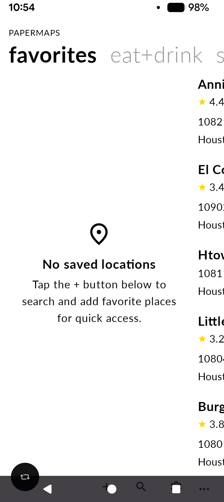
Excited for these! But both PaperTunes and PaperMaps seem to not be properly formatted to the Mudita’s screen. Some of the text of each section is cut off on the left side, and I can see some of the text of the next section peeking through on the right side. Is this intentional?
I recognize this is an aesthetic preference and not a functionality issue so shouldn’t take priority, but do you think it would be possible to reconsider the right side? I would really rather have a series of dots on the bottom of the screen to indicate there are more pages to swipe through to than see some of the next page’s text peeking through.
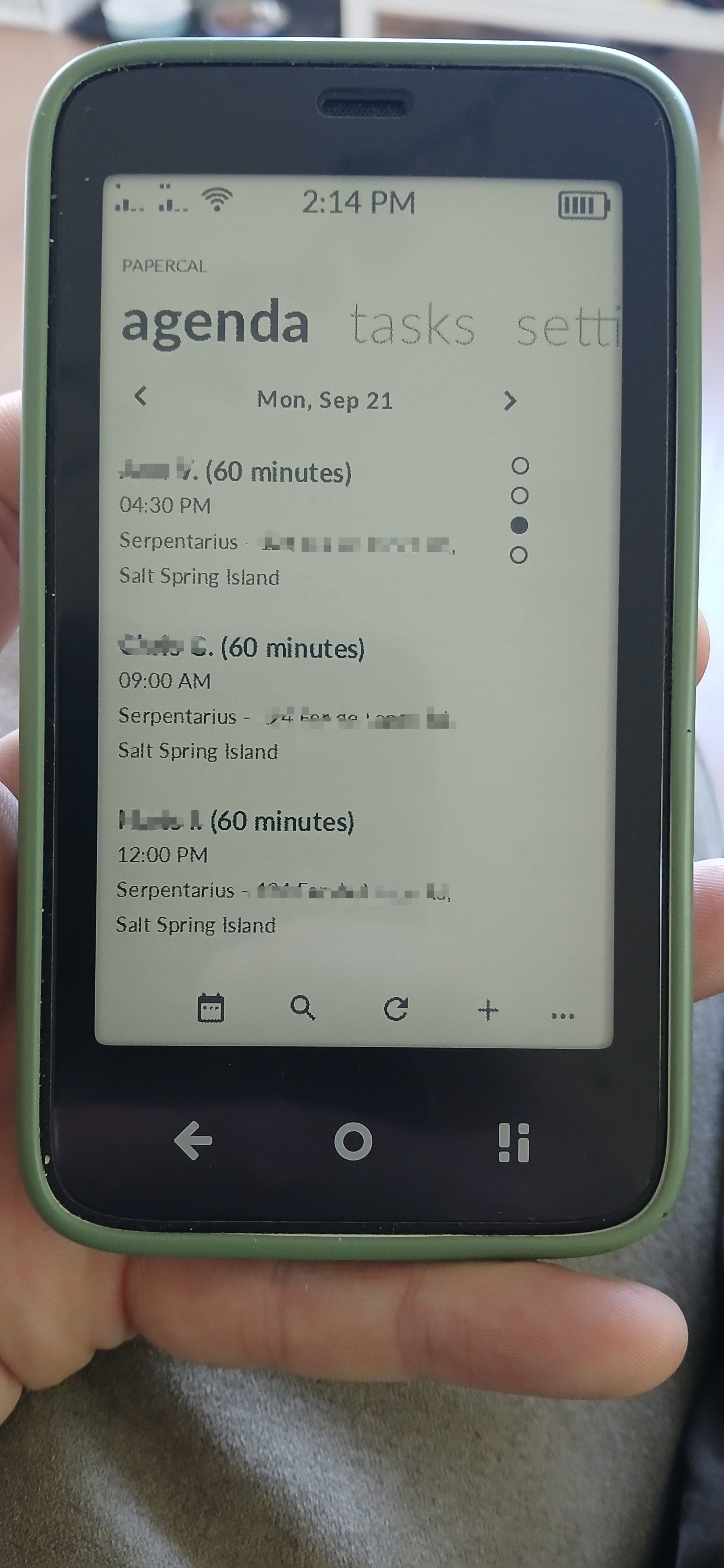
Just trying out papercal, and running in to a few things:
Top bar with agenda/tasks/settings: only setti is visible from the word settings
There is an ~ 3/4 cm space on R side of screen in the agenda display part of the window. For some reason it seems….odd? Maybe its how you intend it to be.
I’m going on a long road trip in a few days and was planning on using CalmDirectory as my map, as it’s worked pretty well so far. I have the route planned ahead of time, just need it to visualize where I’m going and potentially find food/gas on the way. In it’s current state, would you recommend sticking with the april release, or is PaperMaps fleshed out enough to take over?
Separately, thank you so much for the work you’re doing! It gives me a lot of confidence in this phone to see active third party development, especially on such useful, everyday apps.
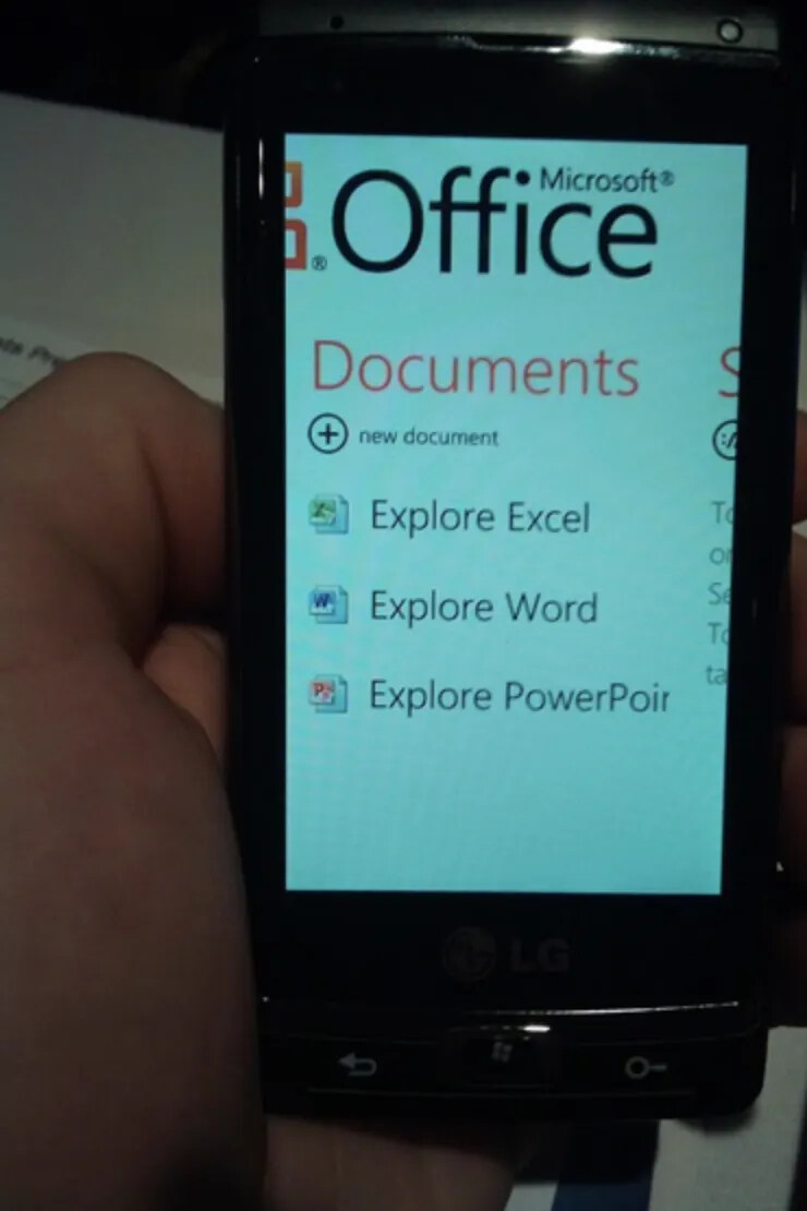
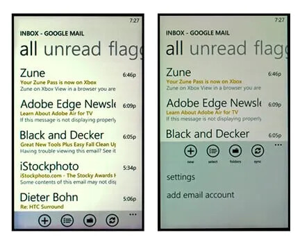
It seems to be in homage to the windows phone 7 or Zune HD ui. My first smartphone was a Windows 7 Phone. It was based on the idea that most of the UI was a horizontally scrolling looping panel. Using it was super intuitive. Personally I really like the aesthetic choices.
Hey, thanks for the feedback. It’s little less odd when the second panel has information in it. You’ll see it more in practice when the app is used more or my other apps like PaperTunes or PaperMaps where there’s consistently more data.
For the events ordering, this will be fixed in the next beta. Thanks for the callout.