After watching materials about Mudita and having the pleasure of testing the Mudita Kompakt live, a few suggestions came to my mind regarding the visual aspects of the interface in the spirit of minimalism.
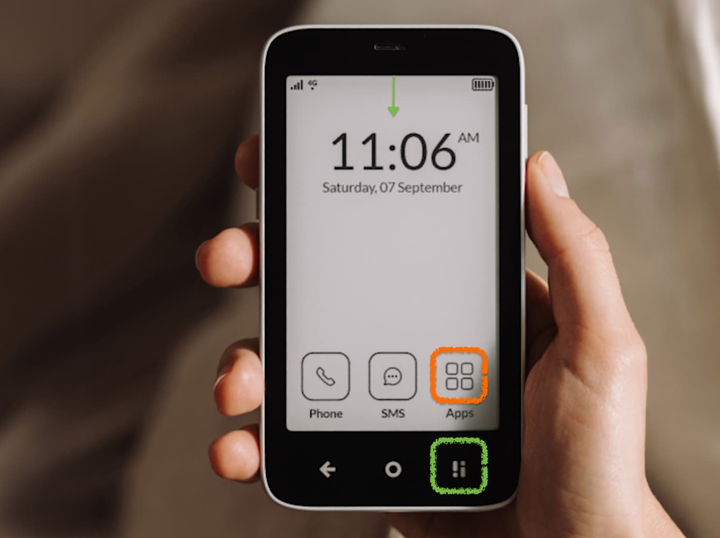
In my opinion, the button (highlighted in green) unnecessarily duplicates functionality (brightness settings, etc.) that can already be accessed by swiping down, as on most phones. I would prefer if this button opened the “Apps” menu instead. Additionally, I think the current “Apps” button location could be replaced with another frequently used app, such as Music or Calendar. The asymmetry caused by the lack of a border around the “Apps” button also disrupts the minimalist harmony of the interface for me. While this might seem minor to some, ever since I first saw promotional materials, this detail has been hard to ignore. It somewhat interferes with the clean, minimalist aesthetic of the home screen.
I feel that the arrows or “next” buttons in the middle of the app menu are unnecessary. They duplicate the natural swiping functionality, which feels much smoother and more modern. These arrows make the interface feel a bit clunky, almost like a train ticket vending machine. Small dots at the bottom of the screen indicating the number of pages and the ability to swipe would suffice. The screen is responsive and smooth, making swiping effortless and intuitive.
Overall, I believe Mudita Kompakt is on the right track, but I’d encourage a more radical unification and removal of unnecessary elements. Occasionally, there are redundant features, disharmonious elements, or an overabundance of styles on the screen. Fight for radical simplicity in the interface. Users won’t get lost without overly explicit markers. People have intuition and will figure out the functionalities after using the phone for a few hours – there’s no need for a signpost at every intersection.
These are just my thoughts as a fan of minimalist design.
I’m excited for the final version of the phone and believe it will be perfect!
I don’t mind buttons that replicate software functions. In fact I find it quicker accessible, no need to search for and tactile, which isn’t bad at all. I respect phones that for example have home and tasks buttons, since sometimes they are not present in software, but necessary.
At the other hand, current design is done. I agree UI should be clean, simple and usable.
@Bocian Thank you for sharing your thoughtful insights on the visual aspects and minimalism of the Mudita Kompakt interface. Your suggestions reflect a deep appreciation for minimalist design and user experience.
I have passed your suggestions to our team.
Yes! That asymmetry on the home screen bothers me too. The app menu icon should also have a border or be replaced with a different icon.
I would also like to be able to set the order of apps in the menu and determine how many appear on each screen. As far as I know, this isn’t possible yet.
Hi, Design Lead on the Kompakt project here!
Thanks so much for sharing your thoughts—it’s always great to see such detailed and thoughtful feedback from our users. I wanted to take a moment to explain some of the decisions behind what you’ve highlighted.
On the hardware button (green highlight), we’ve designed it to always function consistently, no matter where you are in the interface. It provides access to essential phone functions quickly and predictably. Changing it to open the “Apps” menu might seem like a good idea at first, but there’s already a Home button that gives fast access to apps. Adding this functionality to the hardware button would feel redundant and could actually make navigation less intuitive.
Regarding the asymmetry of the “Apps” button—I can see how this might feel off to some, but it was actually a deliberate design choice. We prioritized usability and clarity over strict visual balance. The slight asymmetry gives the layout a dynamic, functional feel while ensuring the button stands out enough to be immediately recognizable and useful. That said, I understand this is a subjective area, and if it continues to bother more users, we’re open to revisiting it.
As for the arrows in the app menu, I hear you! Swiping is definitely intuitive and is already implemented here—it works seamlessly in tandem with the arrows. Having visible navigation elements is part of our design philosophy. We strive to balance gestures with clear, familiar UI cues that work for all users, not just those comfortable with gesture-based interactions. The arrows act as a fallback and ensure that everyone, no matter their level of experience with smartphones, can navigate the interface easily.
I really appreciate your input and the time you took to think through these details. Feedback like this helps us refine the product, and we’ll continue to monitor how these design decisions resonate with users as more people get hands-on with the Kompakt.
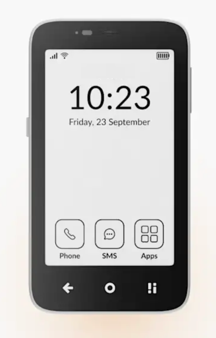
If you deliberately don’t want the “Apps” icon to have a border (so that it stands out), maybe at least enlarge the four squares in the icon so that their size matches the corners of the border in the “Phone” and “SMS” icons.
…because right now, without the border and with the squares being so small (as if the border were supposed to be there), it creates a strange sense of asymmetry. The four squares seem very small, and it looks odd.
Yes, the asymmetry is intentional, as is the lack of a border and the different size of the “Apps” icon. The unique shape of the “Apps” icon required a different approach to composition. Simply stretching it to match the size of the other icons wouldn’t work—even though it feels counterintuitive, according to rules of composition, it would actually throw off the balance and interfere with other design considerations we’ve already accounted for.
I hear you, though, and we’ll definitely keep tweaking the UI to improve usability and create an even more harmonious composition.
Sure, I understand. The most challenging mission in design is always simplicity and minimalism. Personally, I would be fine with just the time and date on the main start screen, but I understand that not everyone likes such a radical reduction of elements.
You’re doing a great job, and I believe that each new version will be increasingly harmonious and simple.
@Tomasz Thank you very much for your response - what you wrote makes a lot of sense. I’m sure you’ve already discussed this thoroughly many times. My intention in writing my post was simply to highlight that, while using the Kompakt live, I sometimes felt there were too many elements, and the thought “this isn’t necessary, less is more” came to mind. Perhaps an option for some level of phone personalization could address this. For example, having a setting to disable certain features that are displayed by default could introduce different levels of minimalism, depending on the user’s preferences.
Personally, I would also prefer a cleaner home screen or a more harmoniously arranged layout. Additionally, the topic of a “negative” theme, which has already been discussed in another thread on the forum, seems important to me as well. It would be fantastic if there were an option to set a black screen with white icons.
As a trigger for further work, I’m sharing below an amateur remix I made while sitting in the metro today:
I love that Mudita has been so thoughtful of the design and functionality of this device. It’s something I have really enjoyed about Pure - such beautiful (to me) minimalistic design while also be easily functional.
On the Kompakt, I can see the hardware control button will be great as a physical (I can feel it) button in low or no light conditions, to quickly access lighting options like flashlight.
Also thanks to @Bocian for the visual mockups, they’re great! I have to say I visually prefer the current Kompakt design WITHOUT the border on the Apps button, and in the order it’s in (for personal left handed functionality) as @Tomasz stated it really does stand out more, from the two main functions of Phone and SMS.
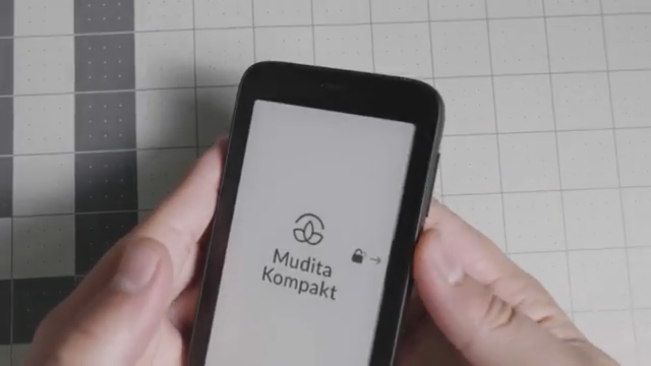
@Tomasz - what is the plan for the locked screen? Will it be possible to customize it to display only the date and time instead of the large company logo?
The idea of the lock icon with an arrow is useful during the first few hours of using the phone, but afterward, there doesn’t seem to be a need for it to stay on permanently. What is your vision for this?
Yeah I love this idea, I do love a screen that literally is blank with nothing but the time, adds extra steps to get to things like texting , adds more friction which I like, this is how my light phone is set up, I have to intentionally take extra steps to get to text messages, slows me down and teaches me PATIENCE, I don’t want things at my fingertips all the time
Nothing I can confirm right now, but we’re actively working on elements like the always-on display, so updates are to be expected! @Zofia
Personally, I really like how Pixel approaches AoD, so I definitely see the appeal. Customization isn’t currently planned, but it does seem like a natural evolution
@kirkmahoneyphd Ad 2. Definitely not, true to the ethos!
Ad 1. Considering E Ink takes less power, AoD shouldn’t be a major drain. Of course, refresh rate and frequency matter, as frequent updates will consume more power than a static display, and a partial refresh (just updating time) is much more efficient than a full refresh. Frontlight usage also could play a role, especially if it stays on constantly.
That said, I’m confident our wizards would work their magic on that—especially since we’re already seeing significant battery optimizations with Kompakt as a whole!
I… believe ( ) it would also be safe to assume we’d add an option to turn off/on/customize AoD.
Perfection is achieved not when there is nothing more to add, but when there is nothing left to take away. Make things as simple as possible, but not simpler.
Late to the party. I must say I really like Bocian’s bottom mockup.
I prefer as mentioned the “apps” to be without border as it functions more as navigation / folder compared to “phone” / “sms” that trigger apps / functions.
Having apps in the middle might feel non standard but for me it makes more sense.
It is placed above the home button which ties it to it as both brings out out to another level
Having it in the middle separated phone and sms even more : both visually but also ergonomically. There is little risk to accidentally press the wrong one. Also the separation will even further make the badge of missed calls / sms unread to stand out.
A final note. As all three icons are so… iconic I feel the need of text redundant. Or at least have the possibility to turn that off in settings.
Keeping the lock / Home Screen as clean as possible and with less visual detail / clutter is essential imo. And removing the icon text labels would further clean it up.