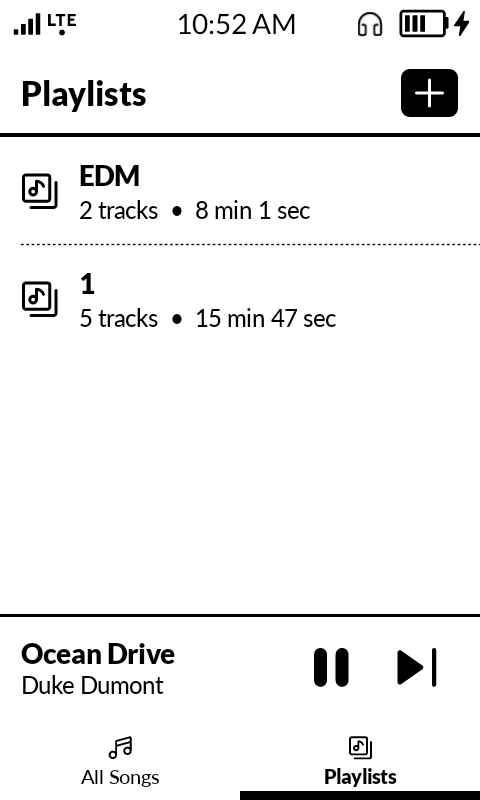
So I see the new update brought playlist support to the stock music app but the playlist/all music buttons now take up a lot of the screen which is very unnecessary. The app should be redesigned so that the “playlist” and “all music” text at the top should be replaced with the buttons. Theres no reasons to have a 2nd text label when the buttons already specify what they are, it only takes up space on the small screen.
I also noticed when shuffling songs the previous track button is the same as the skip forward track button. It should remember the last song you’re skipping back to instead of shuffing the previous track too which makes no sense.
Other suggestions would be being able to long press a song to show a prompt to delete song. Genre/album sorting as well.
edit: I also notice the lowest volume on headphones still seems really loud but when on speaker phone call the max volume seems too quiet.